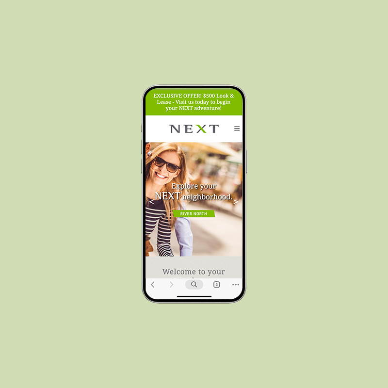
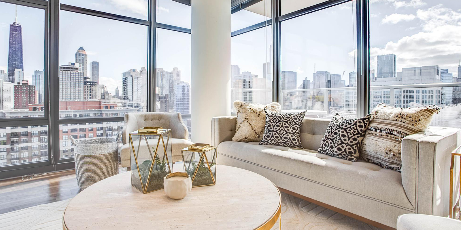
A River North new build asks you for a youthful brand image. How do you tackle that? Easy, leverage a bold color scheme & edgy logo that appeal to its younger millennial target demographic.


The logo leverages sharp angles and contemporary colors to complement the angular and modern aesthetic of the building’s architecture and interior design. Both eye-catching and modern, the logo and brand identity are easily identifiable and own-able.
Next does not fall into the mundane or bland.


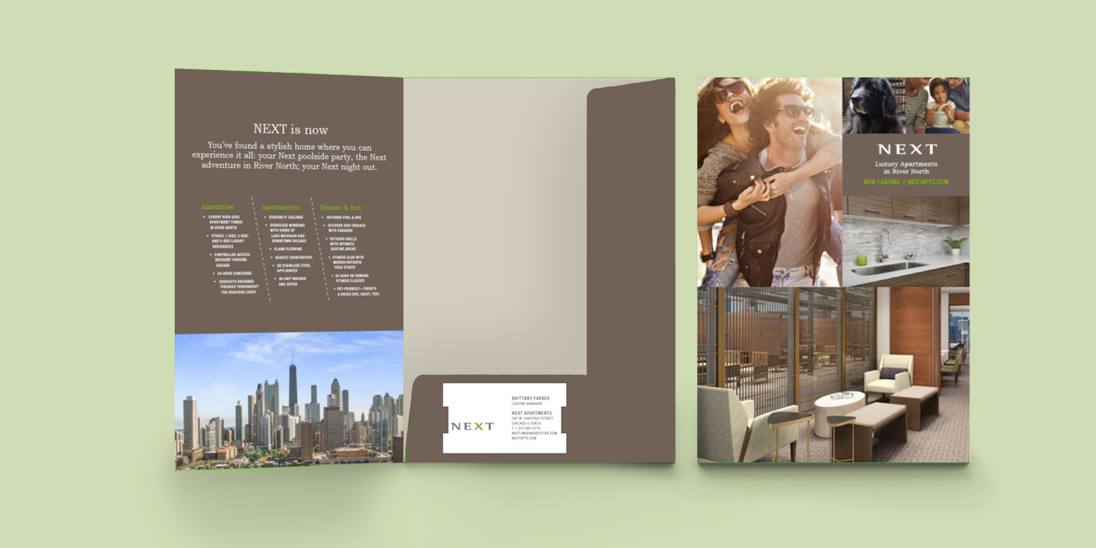
The branding collateral leveraged unique and interesting elements to set Next apart from its neighbors. An angular font and bold color scheme of green and brown brought a youthfulness to the brand that appealed to the millennial target demographic.


